

It’s no secret visuals are essential to creating dynamic, memorable product packaging. However, it takes more than just images and graphics alone to win over customers. Good packaging has a complementary blend of imagery and text that stands out on shelves while communicating a brand’s message. Typography is essential to this balance. When done right, typography design transforms folding carton packaging into a powerful tool that differentiates brands, attracts attention, and communicates value all in limited spaces.
The Role of Typography in Packaging Design
Typography isn’t just about making words look good; it’s about defining and refining your brand’s identity. The fonts you choose, as well as how you arrange text on your packaging, tell customers a lot about your brand. For example, a large, colorful custom font shows your brand is fun and has a big personality, while a more simplistic, modern font emphasizes confidence and clarity. The typography you choose also indicates product value. Premium products might opt for a fancy script to signal luxury whereas a budget-friendly product is better suited by a more approachable, easy-to-read font.
Uses of Typography in Packaging Design
Typography has three main uses in packaging design:
Structuring information
Through visual hierarchy, typography organizes content for better readability.
Creating background textures
Using text as a design element adds depth and interest.
Developing brand name and product type
Typography enhances the visibility and appeal of your brand name and product type, making them stand out on shelves.
Typography Design and Visual Hierarchy
A well-structured visual hierarchy is essential for effective packaging design. Typography is key to achieving this. Using different font sizes, weights, and styles, you can guide a customer’s eye to different levels of information. This hierarchy is broken down into three tiers:
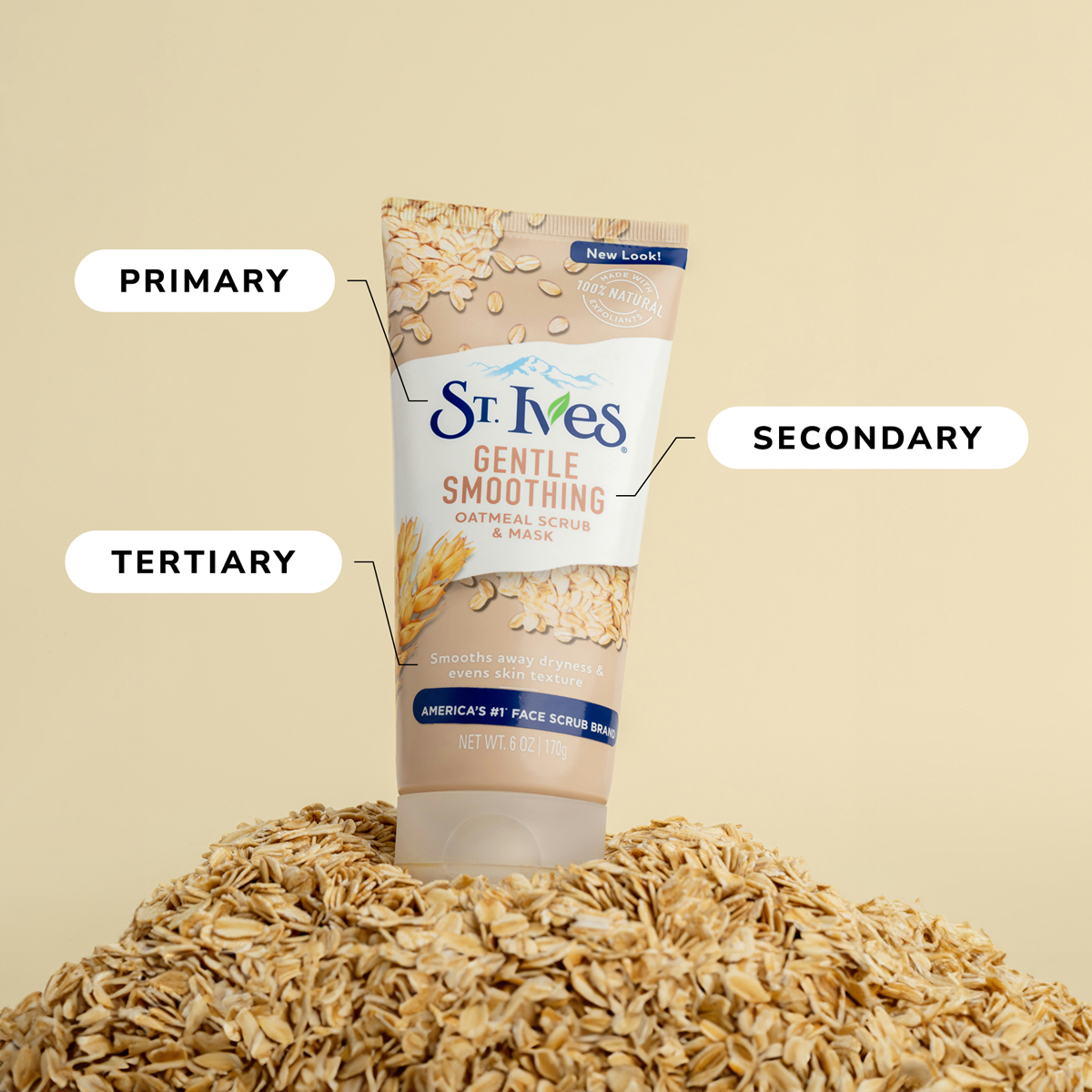
Primary
This section uses the biggest, boldest fonts to bring attention to the most crucial information, such as brand and product names. Custom fonts are best used for primary sections to reinforce brand identity.
Secondary
This middle-size font section calls out product types or flavors, slogans, and other important information like quantity or calorie counts.
Tertiary
This section includes the smallest and simplest text, detailing content such as ingredients, instructions, cautions, or contact details.
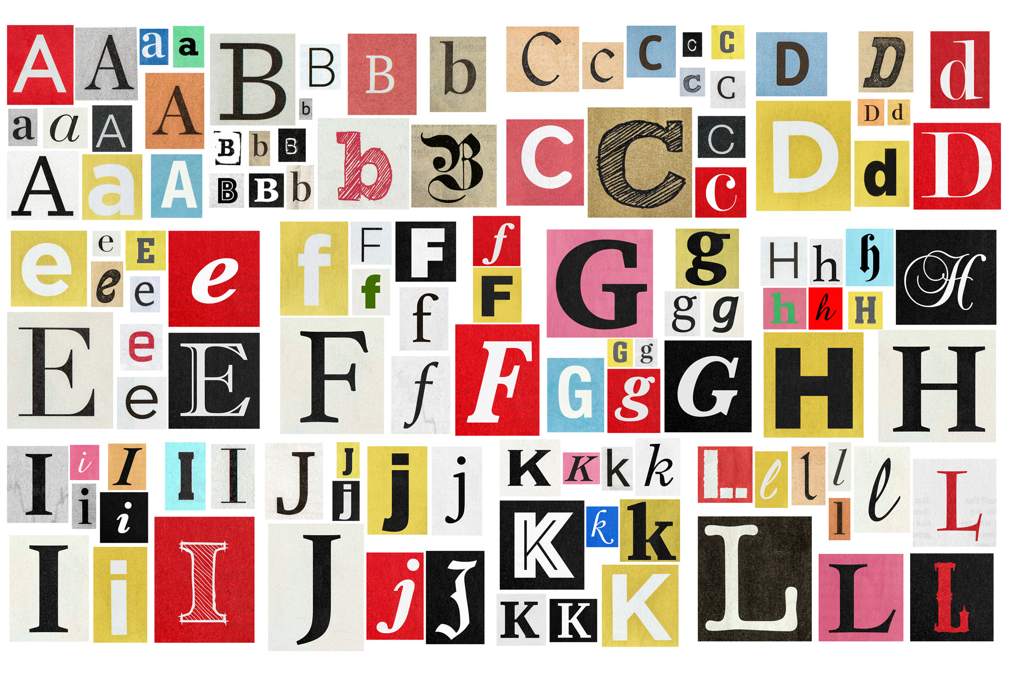
Typeface Categories
Choosing the right typeface is crucial for conveying the correct message. There are four basic categories of typefaces used in packaging:
Serif
These fonts have small lines or strokes, known as serifs, attached to the ends of each letter.
Sans Serif
Clean and modern, these fonts do not include the additional strokes at letter ends.
Script
Resembling handwriting, these fonts are generally considered more elegant or sophisticated than serif or sans serif fonts.
Decorative
These fonts are diverse and do not fit neatly into other classifications. Most unique or custom fonts meant to add character are decorative.
Best Practices for Using Typography in Packaging
As you search for fonts to incorporate into your branding and packaging, make sure your final decisions align with existing brand guidelines. Stick to two or three fonts that complement each other and are easy to read. Don’t include more than three fonts, as this can overcrowd and clutter your design. These distinct fonts, when combined, establish a clear visual hierarchy. Colors, along with icons or graphics, should be used strategically to highlight important text and add visual appeal.