

Colorful packaging is more than just a way to catch shoppers’ eyes from a shelf. It plays a critical role in how customers perceive and interact with products. Using color psychology in paperboard packaging not only attracts attention to a product but also influences purchasing decisions and enhances brand identity. Brands creating new products or redesigning their paperboard packaging should use color strategically to evoke specific emotions and associations and help consumers resonate with the products.
What Is Color Psychology?
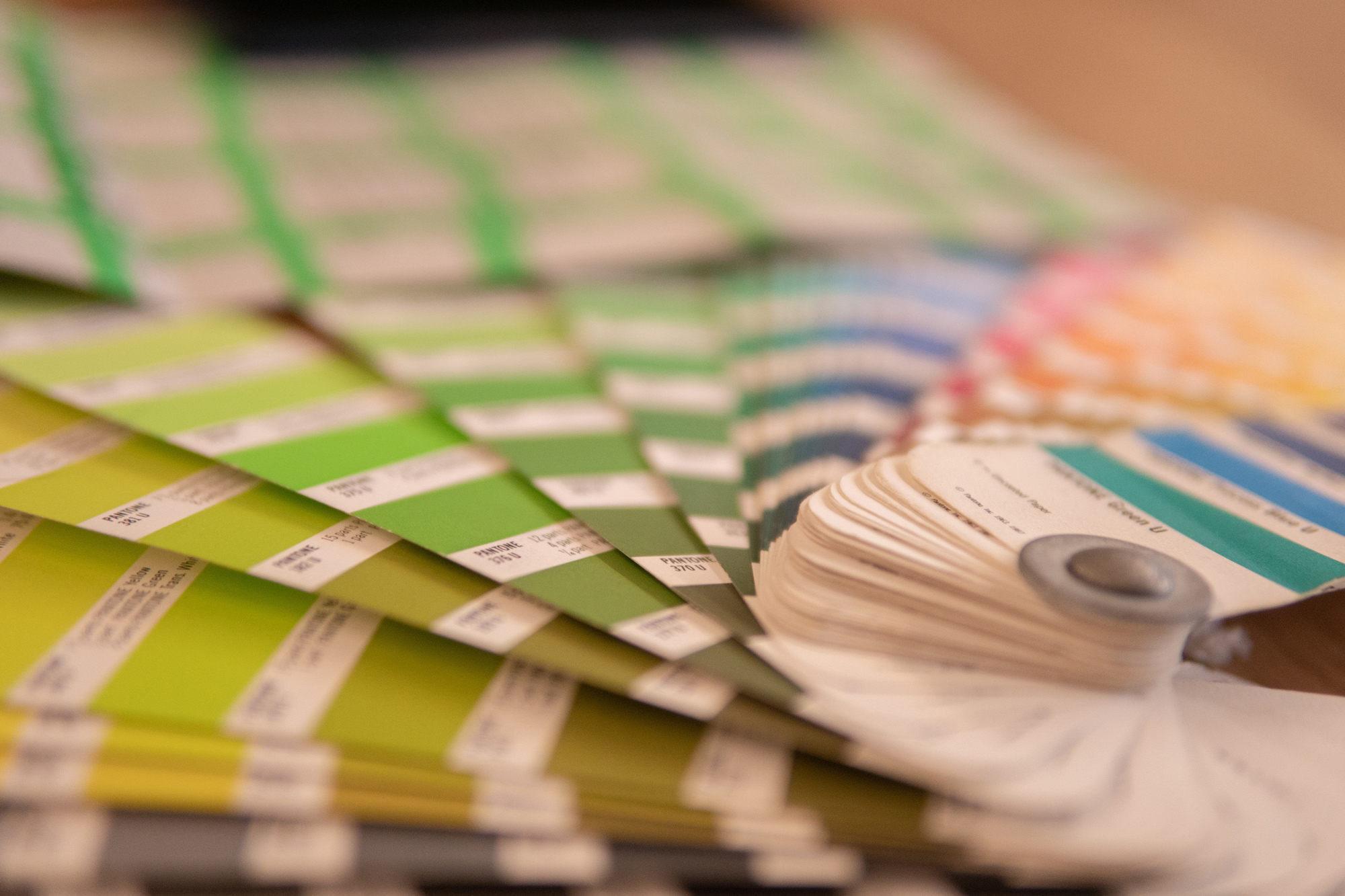
Color psychology analyzes the impact color has on human behavior and emotions. Different colors evoke certain feelings from consumers, though factors such as nationality and gender can vary these reactions. Along with color theory, which is the study of how colors mix, match, and affect one another, color psychology is used in marketing and packaging design. Some common color associations include:
Red
boldness, passion, power, urgency
Orange
friendliness, fun, warmth, creativity
Yellow
happiness, optimism, energy, confidence
Green
eco-friendly, freshness, healthiness, harmony
Blue
relaxation, honesty, logic, dependability
Purple
luxury, exclusivity, indulgence, rare
Pink
love, beauty, youthfulness, playfulness
Black
mystery, strength, premium, sophistication
White
simple, purity, goodness, cleanliness
How to Align Color Psychology With Branded Packaging
Early on in the design process, you should have a strong understanding of your product, brand, competition, message, and ideal customer. The colors you choose to incorporate into your packaging should be indicative of each of these critical factors.
Know Your Product
Some colors are more common in particular industries than others. The colors you choose for your packaging should reflect this to some degree. For example, blue isn’t a common choice for most food product packaging. However, it’s often used in health, beauty, and medical packaging. Food and food service packaging incorporate more greens, yellows, and reds.
Know Your Brand
What word does your organization use to describe its brand(s)? Use colors in your branding that align with these terms. Higher-end premium brands may want to use colors like black, gold, or purple, while more budget-friendly options might consider using colors like white or blue. No matter what colors you choose, consistency across brand materials is important to reinforce brand recognition and loyalty.
Know Your Competition
It’s important to know how your competition is using color to sell their products. You’ll want to stand out from them, but you won’t necessarily want to have your colors be the polar opposite. If your competition is using yellow in their branding or packaging, orange is a nice alternative.
Know Your Message
Colorful packaging can be used to highlight product benefits or features before a customer even gets a closer look. For example, if you’re selling an organic frozen vegetable, using greens and yellows in your packaging conveys the perception of health and energy. Or, let’s say you’re selling health and beauty products. Pinks and blues suggest gender-related products or products that customers can trust to enhance their appearance.
Know Your Customer
Understanding your target audience is essential when creating colorful packaging. Even though most colors have a particular meaning to groups of people, everyone perceives color in their own way. Narrowing down your ideal customer will guide the colors you choose to use. Products meant for wider audiences may want to pick “safer,” more common colors. But if you plan on targeting a niche audience, consider using unique hues that will stand out to this small consumer segment.